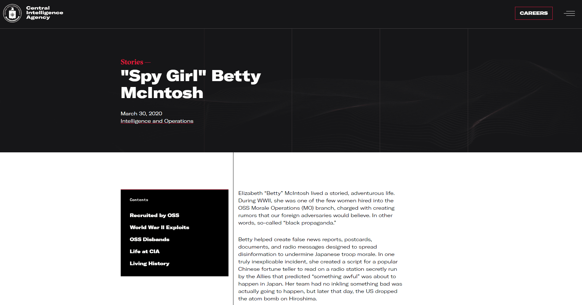
It’s been six weeks since the Central Intelligence Agency made headlines with the launch of its bold new website, and CIA spokespeople are still fielding questions about the modern design. Why the sudden departure from classic government website stylings? How did CIA decide on the colors, graphics, and typography? In this article, we’ll dive into the new cia.gov to examine design choices and what they say about today’s CIA.
In the Beginning
CIA.gov first appeared on the scene in 1997, toward the beginning of the internet age, and looked about as bare bones as you might expect from a mid-90s website. A mosaic banner featuring a bald eagle and CIA’s seal sat atop a stark white webpage. A series of royal blue links at the bottom of the page led visitors to the various sections of the website. The end.

It’s hard to judge these early websites through the lens of today’s technology, but suffice to say that it left something to be desired.
Updates through the late 90s and early 2000s added additional content and improved functionality, but the design aesthetic and color palette remained largely untouched. It wasn’t until 2007 that cia.gov experienced its first major renaissance.

The stark white webpage and floating links were given a cohesive design and structure, with graphic elements, photographs, and a menu structure ubiquitous with the US government’s digital persona. The website’s last major update, in 2013, added new functionality, a more dynamic visual environment, and a friendlier user interface, but it retained a standard white and blue color palette and hierarchal website structure.
Redesign Goals
In recent years, CIA expanded recruitment efforts to reach a broader pool of qualified applicants. As one of the most visible links between the American public and CIA, cia.gov is a critical part of this expanded recruitment strategy.
The new website devotes a great deal of attention to applicant outreach, career opportunities, and a streamlined application process. Beyond that, there is a concerted effort to provide a modern, attractive, and intuitive user experience.
A core principle threaded throughout the website is authenticity. CIA recognizes that its strength comes from its people and their collective experiences. When applicants visit cia.gov, they should see themselves represented. The site showcases reflections from real Agency officers, drawing from the “Humans of CIA” social media series and illustrating what life at CIA could be like for applicants.
A Fresh Look
January’s website launch ushers in a new era of cia.gov, one that accurately reflects today’s Agency, mission, and people. Designers of the website worked diligently to ensure the style represents a balance between functionality and aesthetics, recognizing that both are critically important to the Agency’s target recruitment demographic: Americans aged 18 to 35 years old.
COLOR
Black and white are the website’s primary colors. They work in tandem to create a bold and flexible system which was designed specifically to elevate the website’s accent color: red. As the central accent color, red gives the website a warm tone and cool vibrancy. Together, the three offer a subtle nod to the traditional red, white, and blue. Color saturation is used to dramatize contrast ratios and heighten flexibility for universal accessibility.

GRAPHIC MOTIFS
Graphic motifs are used throughout the website to supplement traditional brand elements like CIA’s seal, which – despite rumors from across the web – has not changed from the original, approved by President Truman in 1950.

These designs, which include interconnected threads, glyph icons (to serve as way finders throughout the website), and interconnecting patterns, work in concert to establish a sense of visual depth and complexity. They subtly highlight communication, landforms, and technology and shepherd cia.gov into the modern era of intelligence gathering.
PHOTOGRAPHY
Intentional imagery is central to the website–as seen in images that are both authentic and inclusive– and which represent a broad spectrum of people, clothing, and scenery. Together, they showcase our diversity, promote inclusivity, and champion the teamwork that is essential to CIA’s success.

Color photos appear throughout and provide respite from an otherwise sharp colorway. Candid takes and boosted photo vibrancy convey a sense of authenticity, insight, and transparency. Slight distortion in photo editing adds some abstraction and intrigue.
TYPOGRAPHY
As a design tool, typography is critically important and can speak volumes about a brand – or in CIA’s case – an institution. The new cia.gov features a diversity of typesets. Bold, modern typesets are combined with more traditional forms to build the clarity necessary to effectively display its breadth and depth of content. Optical weights are used carefully to ensure legibility and improve accessibility.

In Summary
Whether it’s the interested applicant, the teacher looking for classroom materials, or the fiction writer researching for their latest spy novel, the new cia.gov is a resource for all that is modern, accessible, inclusive, and fresh. Photographs, graphic motifs, color, and typography all build upon each other to present a stylish website that reflects today’s CIA.